How to Shade the Figure in Blue Pencil – Step-by-Step Demo for Realistic Results
If you want to create beautiful, realistic drawings using colored pencil, this demo breaks down the exact steps I use to shade a figure clearly, cleanly, and with confidence. This approach is perfect if you're serious about mastering form and light, and want to level up your figure drawing using traditional media.
Want a free process handout?
Enter your email below to download this high resolution and printable version.👇
📽️ Watch the Full Demo Below
How to Shade the Figure in Blue Pencil – with Chris Legaspi
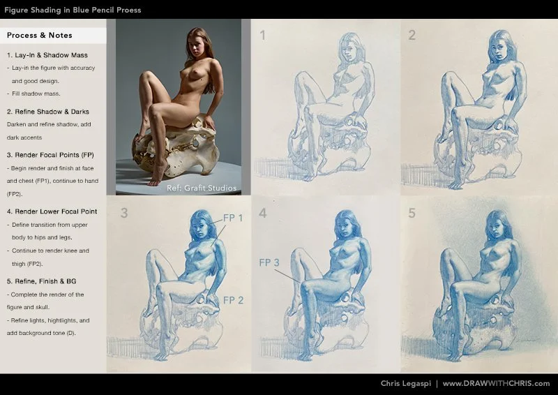
Step-by-Step: Figure Shading in Blue Pencil
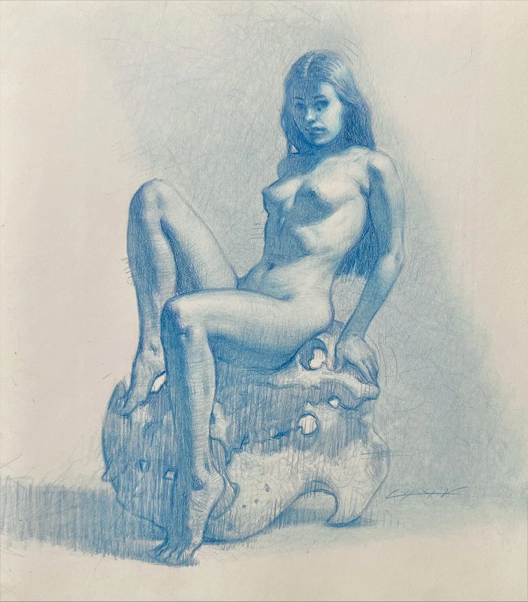
Materials & Reference
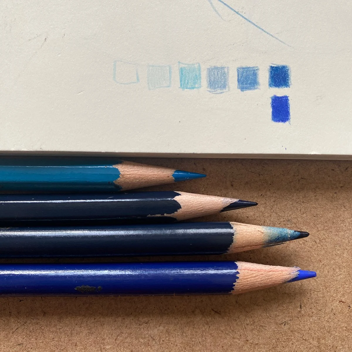
I used a combination of Prismacolor Premiere and Col-Erase pencil on Moleskine paper. Colors used: Indigo Blue & Non-photo blue. If you want to try these pencils and see my favorite drawing supplies and materials, click here to purchase on Amazon.com…
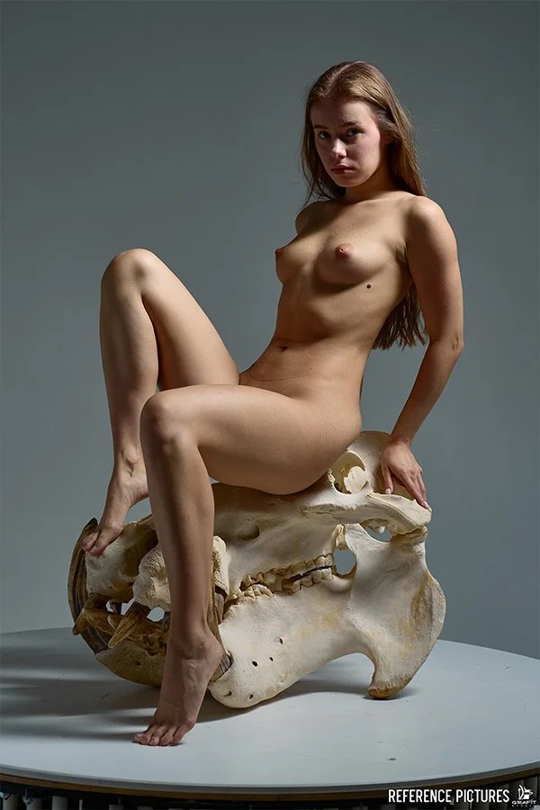
The reference is a professional figure photo from Grafit Studios. They have great lighting, strong pose, and clear forms. Having great reference photography like this really helps make the shading process smooth and intentional. To get the high-res image and more from this photo set, click here to visit Grafit’s full reference library.
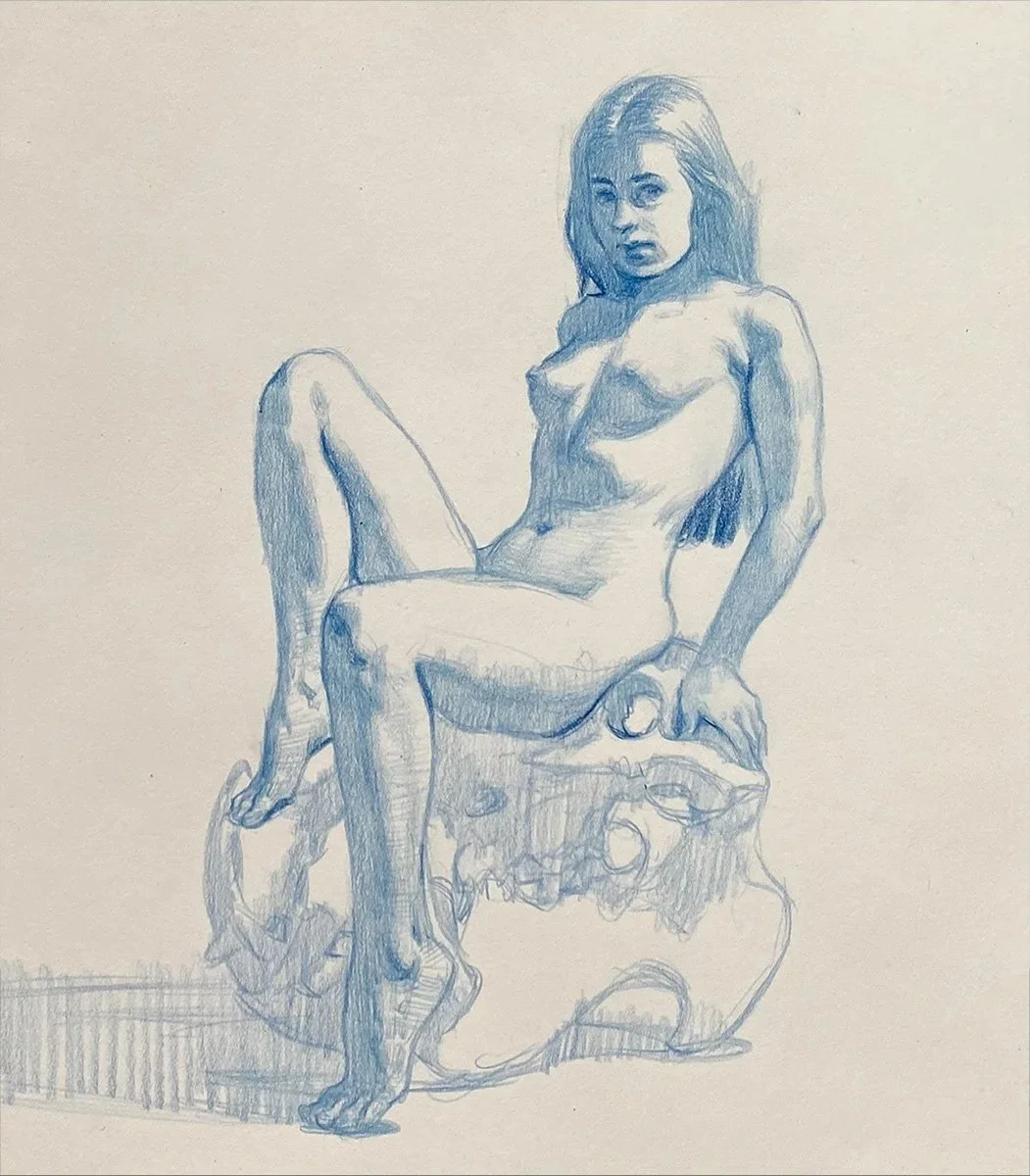
Step 1: Mass in the Shadows
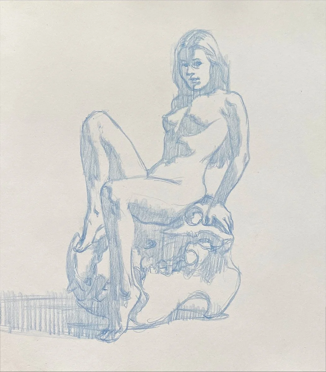
I start by carefully laying in or massing the shadow shapes. My main focus is creating a clean, even tone. I use a light touch, alternating from the point of the pencil to the side of the lead. The main goal is to clearly separate the lights from the shadows.
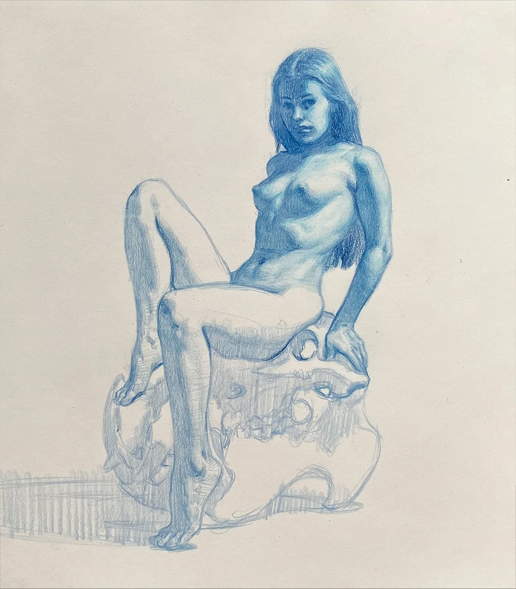
Step 2: Refine the Shadow Mass
Next, I clean up and refine the shapes. I first darken the shadows, then add the darkest dark accents. especially in the face and occlusion shadow areas (areas where forms are touching) such as the armpit, butt and hips. This stage is about clarity and committing to the design of the overall image and the tonal (value) structure.
Step 3: Lights and Half-Tones – Upper Body
Now I begin building light and form, starting at the face and chest. These are the focal points, so I spend the most time here. I slowly layer values, paying close attention to edges, planes and overall value relationships. This creates depth and brings life to the figure.
Step 4: Lights and Half-Tones – Lower Body
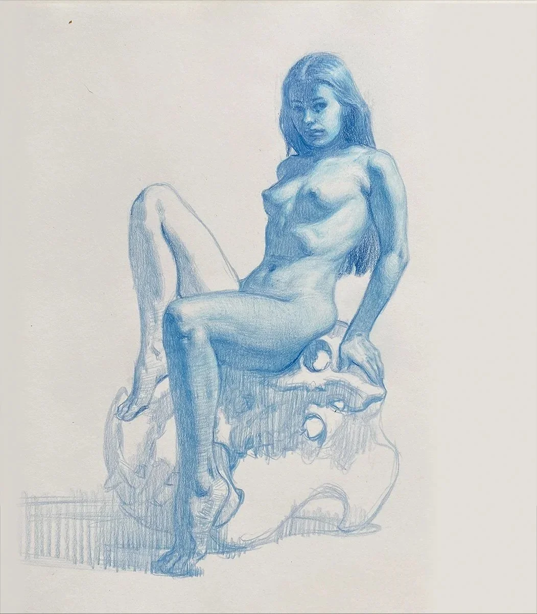
I continue the same approach down to the hips, thighs, and legs. Less detail here helps keep the focus on the upper body. I keep my shading softer and edges more lost in this area to maintain atmosphere and flow.
Step 5: Background Tone
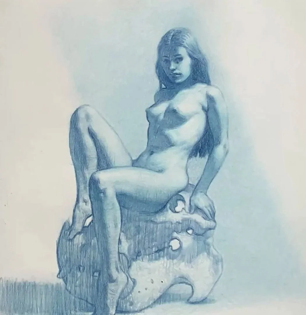
Adding a background tone helps separate the figure and creates contrast. I apply this tone with a very soft touch, using mostly theh side of the pencil lead. My strokes are more chaotic than in the body which creates contrast in technique. I layer the pencil here to build up the value I want, then I wipe with tissue paper to soften marks.
Step 6: Finishing Touches and Lower Focal Point
Finally, I return to the lower focal area, especially the knees and skull. I reinforce shadows, add a few details, and balance the rendering so the eye moves naturally from top to bottom. The goal here is to reinforce the eye flow and control details to create a balance of ‘lost and found’.
Summary
This process gives me a clear, structured and logical way to shade the figure with colored pencil. Starting from large shadow shapes and masses, and slowly building toward detail allows me to maintain control, clarity, and a strong visual design.
If you want to train your eye, hand, and taste to create high quality figurative art, give this method a try.
✔️ Get the Free Figure Shading Handout
Want a high resolution printable version of this step-by-step guide? Enter you email below to get instant access to ALL my process handouts and study guides.
You'll also get exclusive updates, tutorials, and new lesson drops from me straight to your inbox.