Quick Tip: Use Highlight Corners to Add Realism to the Head
If you want your portraits to feel more lifelike and three-dimensional, one quick and powerful method is to emphasize the corners of the face, especially with highlights.
In this short demo, I show how to use white pencil on toned paper to build form and clarity by placing highlights with intention.
Why the Corners Matter
The human head is made of many soft, curved forms—but to make those forms feel solid and dimensional on flat paper, it helps to think in planes and edges.
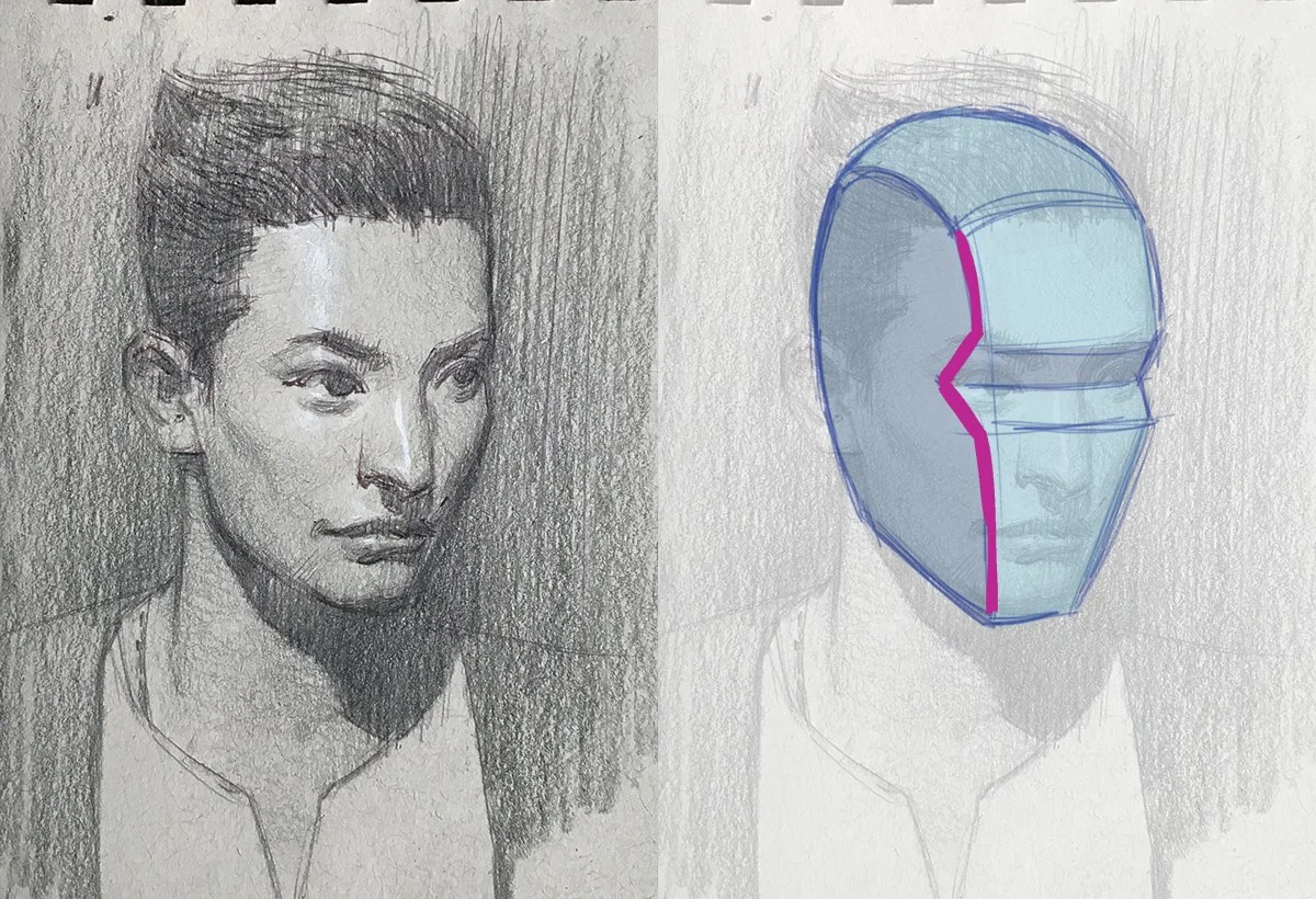
In academic drawing, we often refer to this as box modeling or box logic—treating the head as a box to understand how light hits the forms. One of the most important corners is where the front plane of the face meets the side plane, especially across the forehead and cheek.
How to Use This in Your Drawing
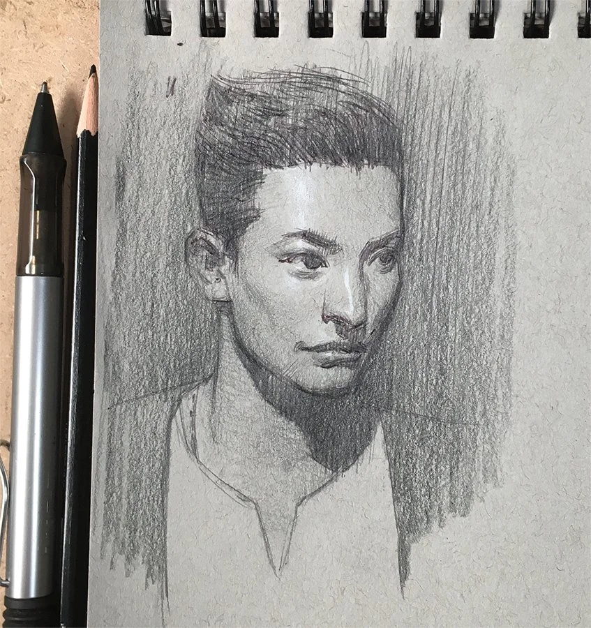
Here is the finished portrait sketch. The tools and materials I used are:
Lamy ballpoint pen
Prismacolor Verithin (Black)
Prismacolor Premiere, white
Strathmore Toned Paper Sketchbook
👉 Click here to purchase on Amazon and see more of my recommended drawing materials.
STEP 1 : Forehead (Upper Corner)

Toned paper helps because it naturally gives you a midtone. Once your construction, shadow mass, and darks are in place, use the white pencil to carefully hit the upper edge of the forehead—right above the eye.
This area is a large, flat surface and a natural light catcher. Because of that, you can go a bit brighter here and create strong contrast to anchor the top of the face.
STEP 2: The Eyes
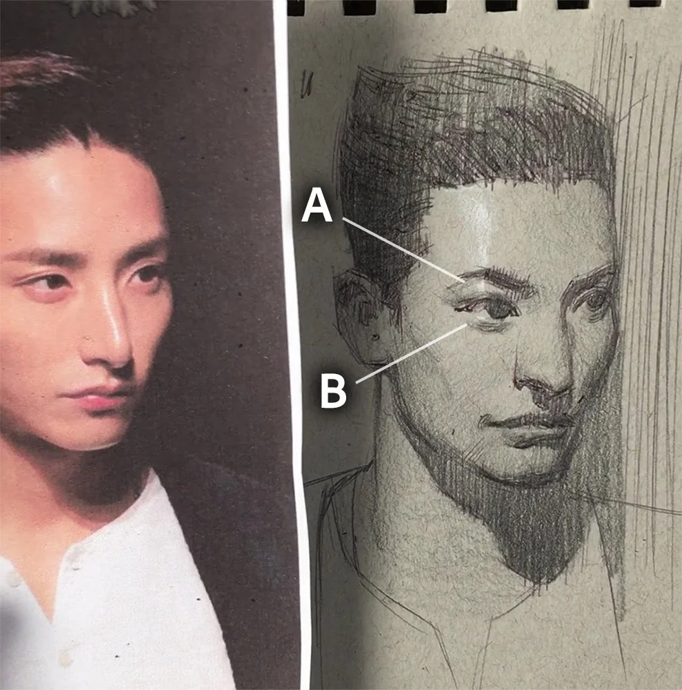
The eyes are tricky—because they are round and sit deep in the socket. To make the eye highlights feel real, you have to be subtle and disciplined. The marks need to be shaped carefully, and the value must be controlled to maintain the illusion of depth.
In this step, value control is critical. If your highlight is too bright, it’ll flatten the form. If it’s too soft, it won’t read. Notice how my pencil marks also describe the anatomy—like the orbital fat pad (A) and lower eyelid (B).
STEP 3: The Nose
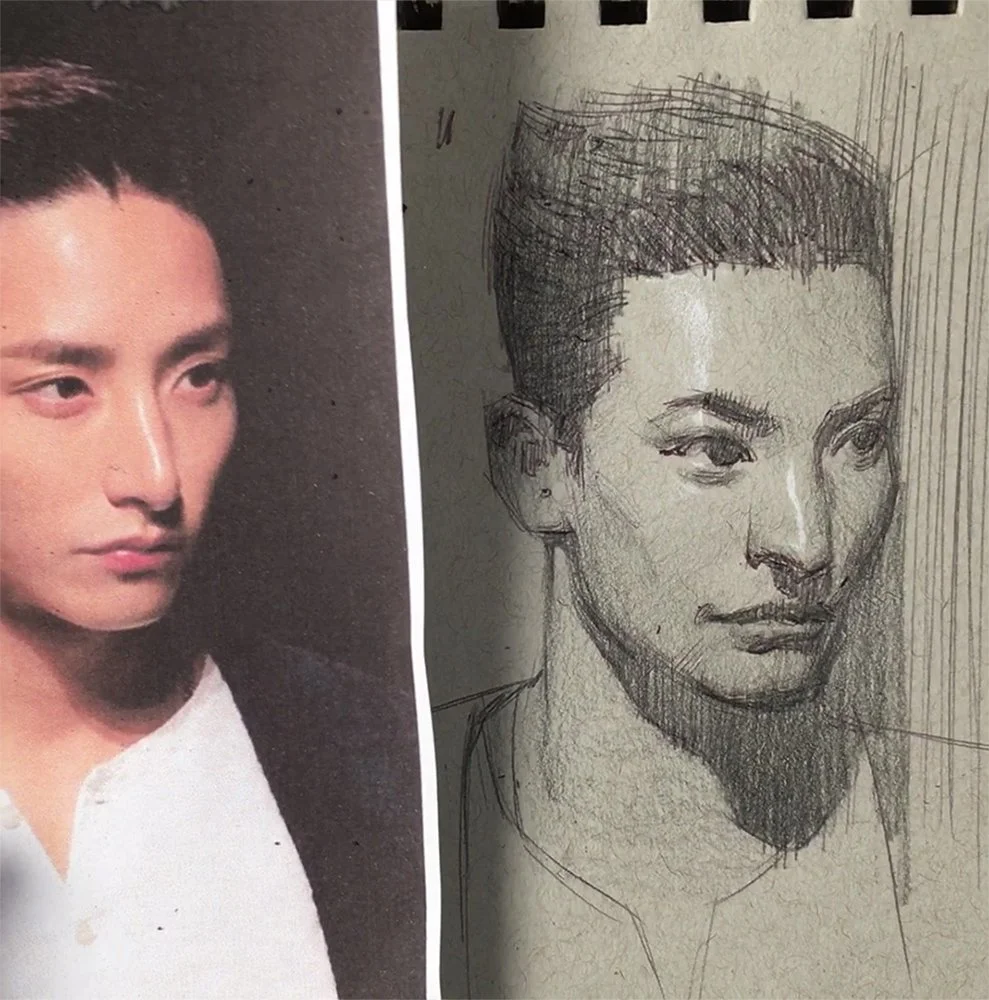
The nose is a key structural element in the face. A clean highlight along the ridge of the nose not only helps the nose feel three-dimensional—it makes the entire head pop off the page.
STEP 4: The Mouth & Chin (Lower Corners)
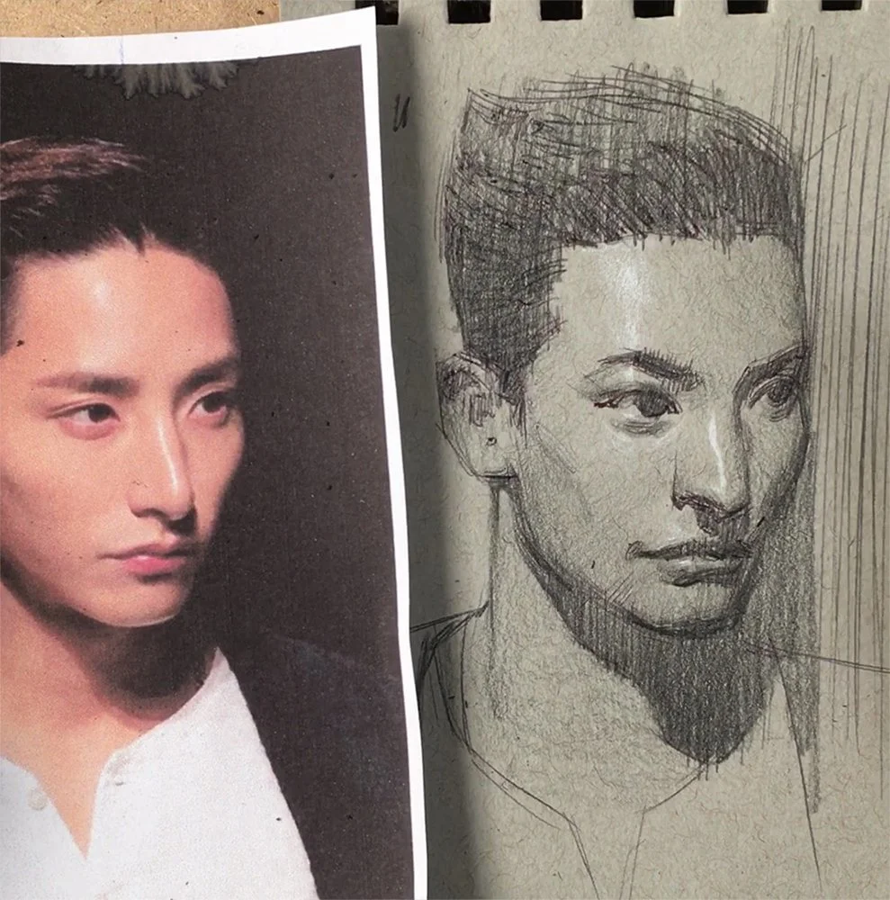
These last highlights complete the illusion of the head as a solid form. Add a soft highlight to the upper lip and a slightly brighter one to the chin.
Because these areas are farther from the light source, be careful not to make them too bright. Even if it looks lighter in your reference, the effect of light falls off here—so your drawing should reflect that.
Remember: you’re not copying, you’re crafting illusion.
Final Thoughts
If your portraits feel soft or flat, look to the corners. Well-placed highlights, especially when drawing on toned paper, can help define the head’s planes and add structure and realism. Start simple. Stay disciplined. Let the light do the work.
Want to Practice More Realistic Portrait Drawing?
Practice makes perfect. If you enjoyed this quick tip and want to keep improving, I have several step-by-step portrait drawing handouts available—free for subscribers.
👇 Enter your email below to download them instantly: