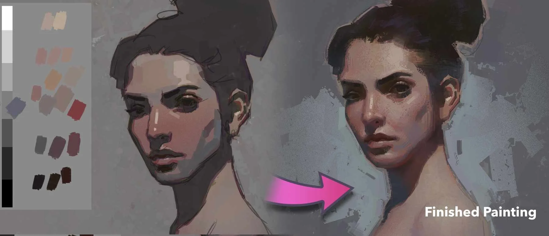
How to Start Painting Portraits in Color (Start With Brown)
An easy, reliable way to begin painting portraits directly in color without guessing.
If starting a portrait in color feels intimidating, you’re not alone.
Most artists struggle not because color is mysterious, but because they don’t know where to begin. They jump straight into reds, yellows, and details, and the painting quickly feels muddy, out of control, or wrong.
In this short demo, I’ll show you a simple, proven way to start painting portraits directly in color using one foundational idea that changes everything.
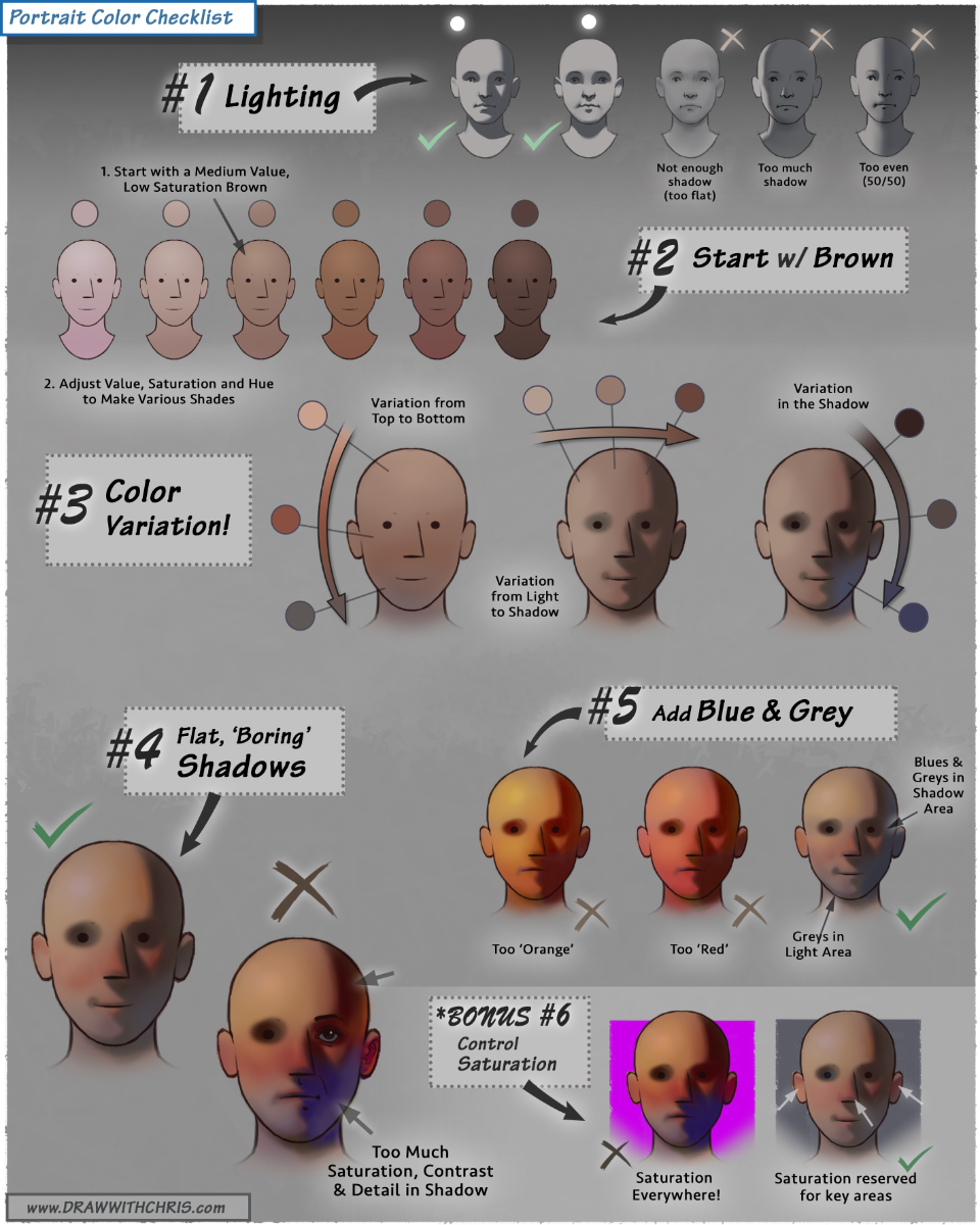
👉 Portrait Color Checklist
Want to download a high-resolution, printable version?
Enter your email below to get instant access 👇
The Core Idea
Human skin is not red. It’s not yellow. And it’s definitely not pink.
At its foundation, skin is a range of browns.
Once you understand this, starting a portrait becomes calm, logical, and repeatable. Instead of chasing colors, you design value and temperature relationships first, then let color emerge naturally.
This approach works for beginners and professionals alike, and it’s one I use constantly in my own work.
Start With Brown
Make it stand out
Brown is powerful because it already contains all three primaries. Orange + blue = brown.
That means when you begin with brown, you’re starting with a color that is already neutral, flexible, and perfect for skin. Rather than guessing with many colors, you establish a solid foundation that can be pushed warmer, cooler, lighter, or darker with control.
Pro-Tip: If the brown looks right, everything built on top of it will be easier.
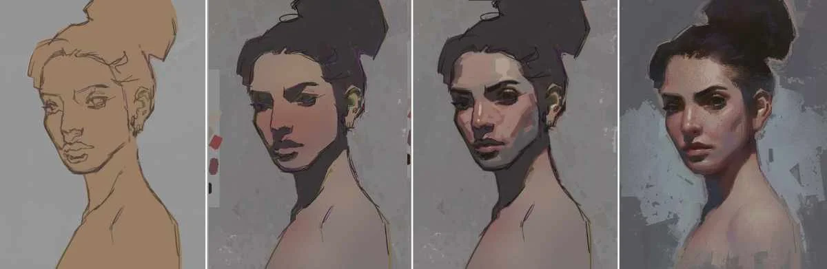
The Simple Process
Step 1 - Make a Brown
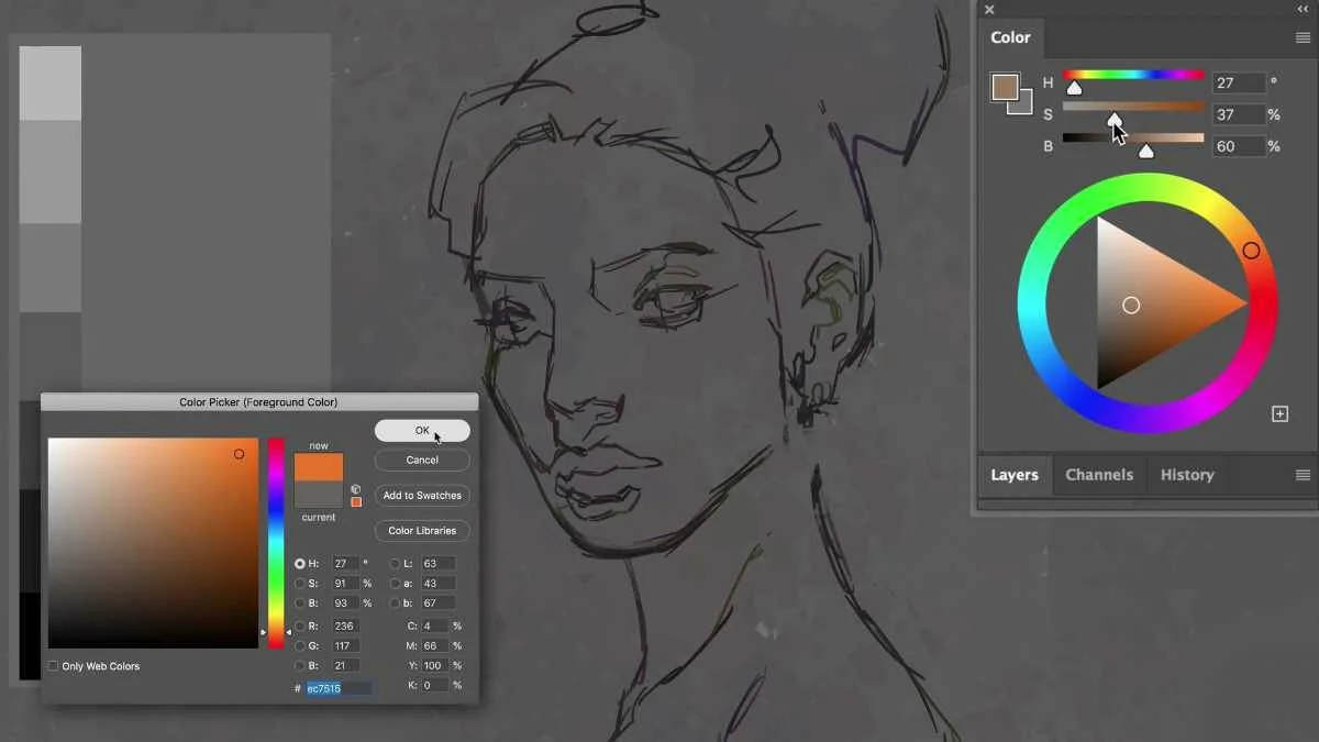
The make a natural looking brown base, first select orange. Any orange will work. Then slowly introduce blue until the color neutralizes into a brown that feels natural and skin‑like. Don’t overthink it. This is your starting block‑in color.
Step 2 - Adjust Value and Saturation
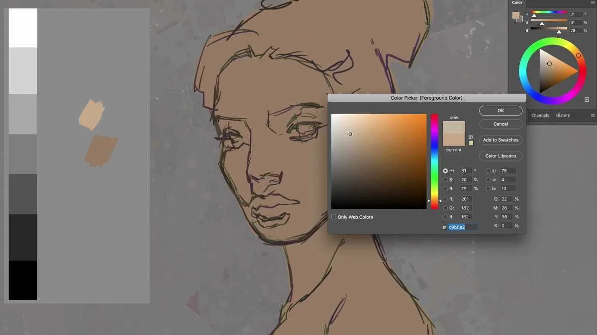
Before worrying about exact color, get the value right.
Lighten or darken the brown to match the general skin tone of the subject and the overall lighting
Reduce saturation so the color stays calm and believable
This step alone solves most beginner color problems.
Step 3 - Add Color Variation
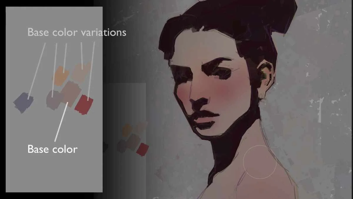
Skin is not one flat color.
From this single brown, create gentle variations:
Slightly darker versions
Slightly redder versions
Slightly cooler blue‑gray versions
Gradients and subtle shifts do the heavy lifting here. You don’t need dozens of colors, just thoughtful variation.
Step 4 - Develop the Painting (Without Overdoing It)
Once your color foundation is solid:
Separate light and shadow clearly
Add darker accents to turn form
Introduce highlights sparingly
This demo focuses on starting correctly, not finishing every detail. A strong beginning makes the rest of the painting far easier.
Why This Works
This method removes guesswork. You’re no longer chasing color. You’re designing value, temperature, and structure, the same way great painters always have. If your portraits tend to look too red, too orange, too gray or just feel simply “off”, this approach will immediately bring more control and confidence.